How to create animated plot in R
Static charts are great for visualization, but there are times when we want to “wow” the audience with chart animations for dramatic effect. Lucky for us R has a great package that can help us create animated charts.
We will use the gganimate package to create animated charts.
You can install this by using the following command.
install.packages("gganimate")
We have already downloaded it so we will just run it below.
We will plot the stock market returns since the 2016 elections. So lets get our data first and create our “boring” static chart.
Lets load the libraries.
library(tidyquant)
library(tidyverse)
price_df <- tq_get(c('DIA', 'SPY', 'QQQ', 'IWM'),
from = "2016-11-1",
get = "stock.prices")
ret_df <- price_df %>%
group_by(symbol) %>%
tq_transmute(select = adjusted,
mutate_fun = periodReturn,
period = "monthly",
col_rename = 'ret') %>%
mutate(ret = if_else(row_number() == 1, 0, ret)) %>%
mutate(cr = cumprod(1 + ret) - 1)Now lets plot our static chart.
price_df %>%
  group_by(symbol) %>%
  tq_transmute(select = adjusted,
               mutate_fun = periodReturn,
               period = "monthly",
               col_rename = 'ret') %>%
  mutate(ret = if_else(row_number() == 1, 0, ret)) %>%
  mutate(cr = cumprod(1 + ret) - 1) %>%
  ggplot(aes(x = date, y = cr, group = symbol, color = symbol)) +
  geom_line() +
  geom_point() +
  geom_point(size = 2) +
  scale_y_continuous(breaks = seq(-0.35,1, 0.1),
                     labels = scales::percent) +
  coord_cartesian(clip = 'off') +
  labs(title = 'Major Index Returns since Trump\'s Elections in 2016', y = 'Returns (%)') +
theme_minimal() 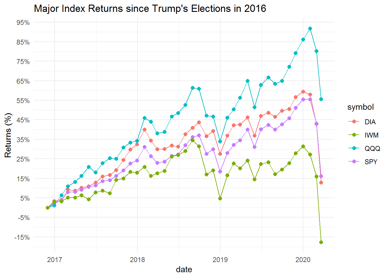
Now lets see how the charts look when we use the gganimate package.
library(gganimate)

p <- ret_df %>%
  ggplot(aes(x = date, y = cr, group = symbol)) +
  geom_line() +
  geom_segment(aes(xend = ymd("2020-03-25"), yend = cr), linetype = 2, colour = 'grey') +
  geom_point(size = 2) +
  geom_text(aes(x = ymd("2020-03-26"), label = symbol), hjust = 0) +
  scale_y_continuous(breaks = seq(-0.35,1, 0.1),
                     labels = scales::percent) +
  transition_reveal(date) +
  coord_cartesian(clip = 'off') +
  labs(title = 'Major Index Returns since Trump\'s Elections in 2016', x = "Date", y = 'Returns (%)') +
  theme_minimal()

animate(p, nframe = 200, end_pause = 20)
To save this chart use the following code.
anim_save("index_since_Trump_election.gif")